Flexible Regression: Mixed Models and Splines
All Mixed Model questions were computed using STATA, and all Splines questions using R.
Mixed Models- No. 1
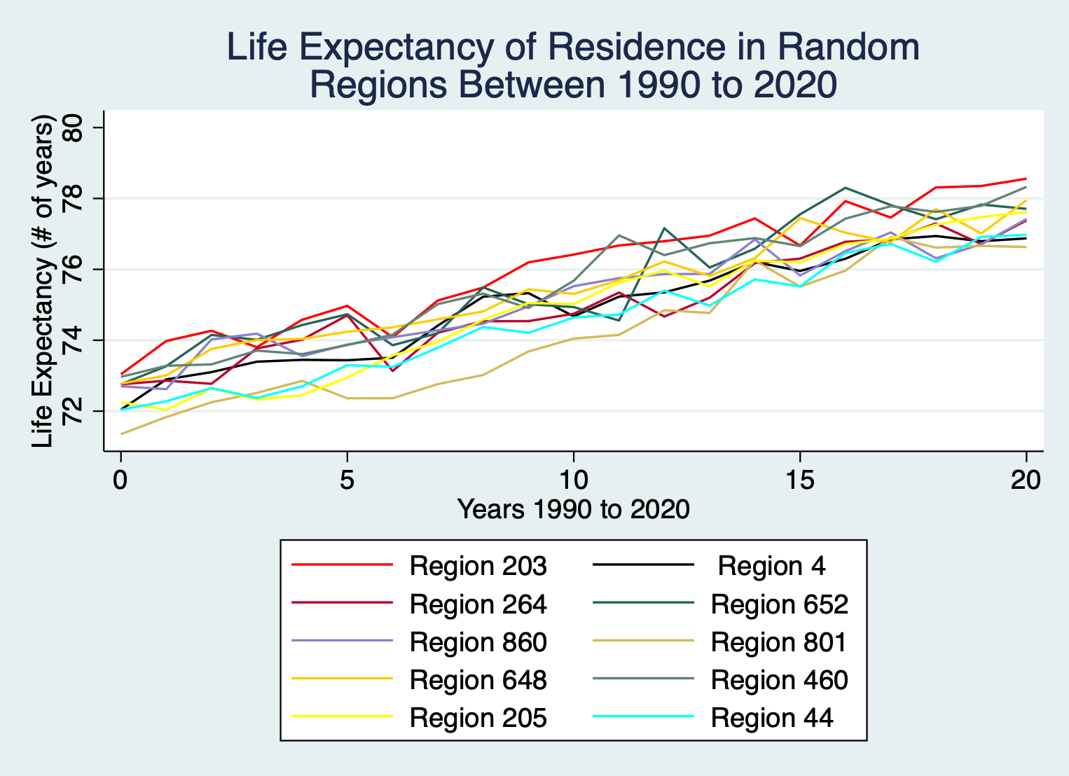
Figure M1: Average life expectancy for residence in 10 regions between 1990 and 2010
For the 10 regions selected, life expectancy has increased by 5.08 year on average between 1990 and 2010. While all regions have increasing life expectancy, each region's growth is unique.expectancy. Within a single year life expectancy can differ from region to region by up to approximately 2.12 years.
Mixed Models- No. 2
\(Y_{it} = \alpha +\beta t+ \alpha_i +\beta_it + \epsilon_i\)
Where:
\(i\)= region
\(t\)= year
\(Y_{it}\)= the life expectancy of a person in region \(i\) at year \(t\)
\(\alpha\)= the population intercept
\(\alpha_i\)= the deviation of region \(i\) from the population intercept
\(\beta\)= the population slope
\(\beta_i\)= the deviation of region \(i\) from the population slope
\(\alpha_{i} \sim N(0,\sigma_\alpha^2)\) is the assumption that the deviations of regions \(i\) from the population intercept are normal and \(\beta_i \sim N(0,\sigma_\beta)\) is the assumption that the deviations of regions \(i\) from the population slope are normal.
The 5 possible covariance structures are dependent on the random effects- Region: year on the slope and intercept
- Unstructured: \(\sigma_\alpha^2 >0, \sigma_\beta^2 > 0, \sigma_{\alpha \beta} \neq 0\)
- Independent: \(\sigma_\alpha^2 >0, \sigma_\beta^2 > 0, \sigma_{\alpha \beta} = 0\)
- Identity: \(\sigma_\alpha^2 = 0, \sigma_\beta^2 > 0, \sigma_{\alpha \beta} = 0\)
- No constant variance: \(\sigma_\alpha^2 > 0, \sigma_\beta^2 = 0, \sigma_{\alpha \beta} = 0\)
- No random effects
Mixed Models- No. 3
Table M1: Model Evaluation Table
| Covariance Structures | AIC | BIC |
|---|---|---|
| \(\sigma_\alpha^2 >0, \sigma_\beta^2 > 0, \sigma_{\alpha \beta} \neq 0\) | 1549.335 | 1561.269 |
| \(\sigma_\alpha^2 >0, \sigma_\beta^2 > 0, \sigma_{\alpha \beta} = 0\) | 1548.858 | 1558.803 |
| \(\sigma_\alpha^2 = 0, \sigma_\beta^2 > 0, \sigma_{\alpha \beta} = 0\) | 2244.112 | 2252.068 |
| \(\sigma_\alpha^2 > 0, \sigma_\beta^2 = 0, \sigma_{\alpha \beta} = 0\) | 1569.03 | 1576.986 |
| No Random Effects | 3114.925 | 3120.892 |
The model with independent covariance structures is the most appropriate- it has the lowest AIC and BIC values at 1548.858 and 1558.803 respectively.
Mixed Models- No. 4

Figure M2: Graph of Observed Life Expectancy for Regions 860, 864, and 868 and their fitted counterparts from the independent model
When the observed and fitted values are compared it is clear that the predicted lines simply connect the first and last observed value for each region. Observed life expectancy does not increase linearly, and wavers a lot during the 21 year period. Therefore the selected model from no.3 is not appropriate for predicting the year to year life expectancy changes.
Mixed Models- No.5

Figure M3: Graph visualising the estimate random intercept and slope for each Region within study
Regions 403, 9, 2 and 804 do notably worse in life expectancy than the other regions. In 1990, they have a lower life expectancy compared to other regions and their growth of life expectancy also occurs at a much slower rate. Conversely, regions 204, and 272 perform best, both beginning at higher life expectancy in 1990 and having faster growth than many others. Though regions 664, 244, and 205 have very average life expectancy in 1990 their average year over year growth is much better than the others.
Mixed Models- No 6.
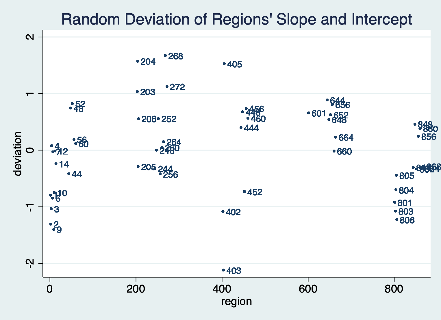
Figure M4: Graphing \(\hat{\alpha}_i + \hat{\beta}_i\) for each region, where deviation= \(\hat{\alpha}_i + \hat{\beta}_i\)
Figure M4 shows that region 268 has the highest life expectancy compared to the other regions within the study. Whereas Figure M3 shows that even though region 268 has the highest life expectancy in year 0 it did not experience as much growth compared to other regions over the 21 year period. Even though region 268 has not experienced the most growth in life expectancy, it was still above average, and combined with the highest life expectancy at year 0 it had the second highest in year 2010, which is why it still performs best.
Splines- No. 1
From plotting the weight crystals (y-axis) against the temperature (x-axis) they are made at, the peak yield on weight = 26.24465047 occurs when the temperature is 16.3 degrees. Once temperature surpasses ≈19 degrees the weight drops below 10, and mostly wavers between a weight of 0 and 5 after 20 degrees (with few exceptions). Generally lower temperatures yield higher weights.
Splines- No. 2
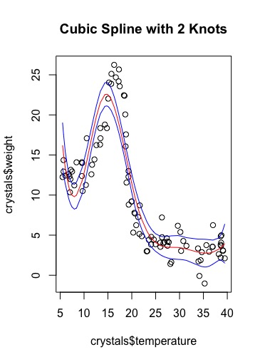
Figure S1: Plot of Weight against covariate temperature with a regression model of a fitted cubic spline with 2 knots (red line) and 95% confidence interval values (blue lines) of the fitted values.
a) A cubic spline with 2 knots has 6 degrees of freedom.
Splines- No. 3
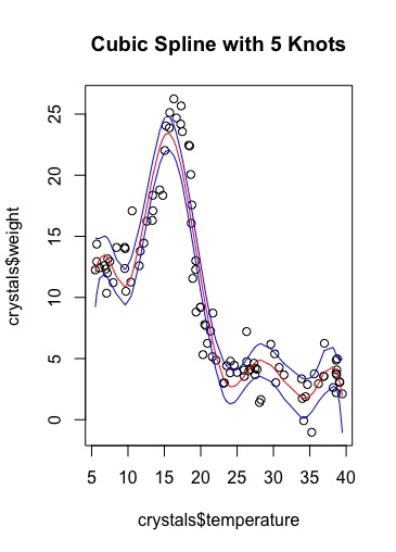
Figure S2: Plot of Weight against covariate temperature with a regression model of a fitted cubic spline with 5 knots (red line) and 95% confidence interval values (blue lines) of the fitted values.
a) A cubic spline with 5 knots has 9 degrees of freedom.
Splines- No. 4
Albeit not precise, the splines do roughly characterise the relationship between weight and temperature. The peaks are in similar positions to the actual max; but both peak early and do not raise as high as the actual peak. The regression lines fit within the 95% confidence intervals. The confidence intervals are much wider before and after the incline and decline towards and from the peak. When they are narrower the predicted weights of crystals are more likely to be accurate in comparison to the wider confidence intervals. As the degrees of freedom has increased oscillation has become visible.
Splines- No. 5
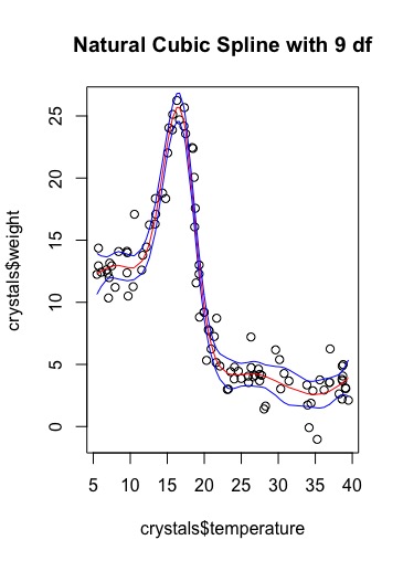
Figure S3. Plot of Weight against covariate temperature with a regression model of a fitted natural cubic spline with 9 df (red line) and 95% confidence interval values (blue lines) of the fitted values.
Splines- No. 6
Some of the issues spotted in Figure S2 appear to have been fixed by using a natural cubic spline with 9 df. The predicted peak weight of crystals is much more accurate with the lower and upper confidence intervals containing the actual peak, and the range of weights around peak temperature. The oscillation visible in the 5 knot cubic spline, is not visible here, and the confidence intervals before and after the peak on the inclining and declining slopes are much more narrow suggesting more accuracy of the regression line within those ranges of temperature.
Splines- No. 7
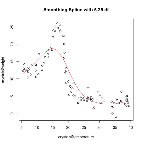
Figure S4. Plot of Weight against covariate Temperature with a smoothing spline with 5.25 df

Figure S5. Plot of Weight against covariate Temperate with a smoothing spline with 10.5 df
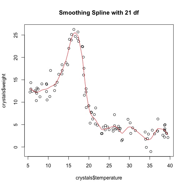
Figure S6. Plot of Weight against covariate Temperature with a smoothing spline with 21 df
At 5.25 df the smoothing spline is not a good fit for the data, it follows the basic shape of the data, but cannot meet the full range of weight values. At 10.5 df, the smoothing spline has an improved fit (compared to 5.25 df), its peak reaches further towards the max, but still does not reach the cluster of highest weights. At 21 df, the smoothing spline best fits temperatures <<20 degrees, but begins to oscillate after this temperature. Oscillation became visible at 10.5 df and became worse at degrees of freedom increased. The smoothing spline with 21df though not perfect does best predict the weights of crystals depending on the temperatures they are made at.
Splines- No. 8
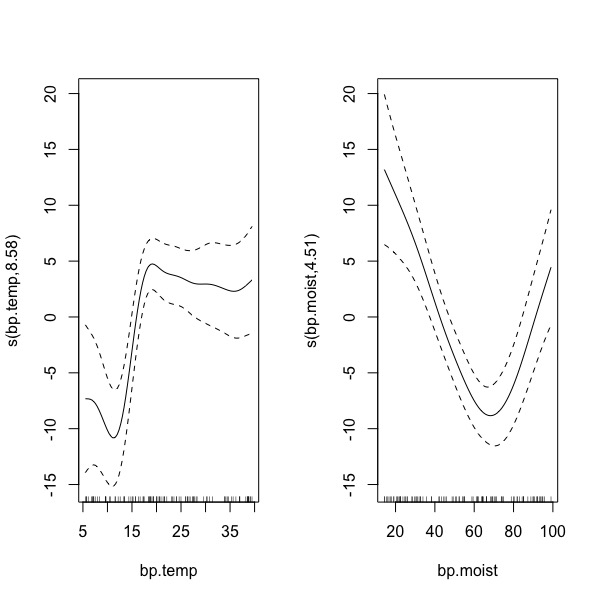
Figure S7. (L) Plotted smooth function on bp.temp (R) Plotted smooth function on bp.moist Stata Code
Yes, the relationship between bp.temp and bp.weight and that between bp.moist and bp.weight are non-linear.